Feature toggles in trunk-based development for Android

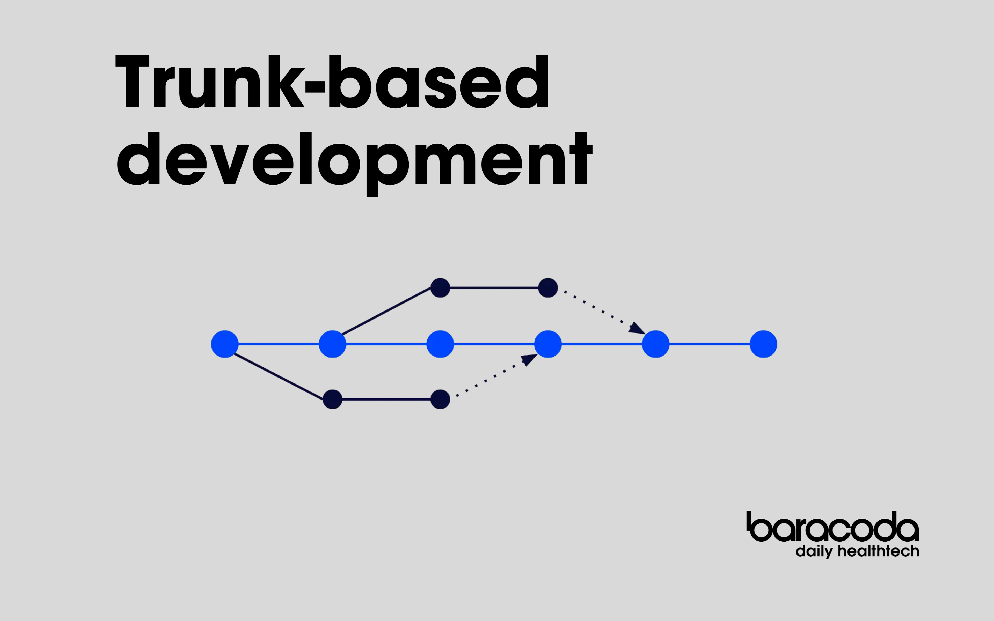
On Baracoda's Android team, we are practitioners of trunk-based development. We favor short-lived branches, which are immediately merged into the trunk once they are reviewed — and at the same time, we always want the trunk to be ready for the next release.
For simple changes, like small features or bug fixes, this won’t cause any issues. But what about cases where we want to introduce something bigger, like a brand new feature, which will take several weeks of work and a bunch of pull requests to complete? Or what if we want to gradually refactor a big chunk of code without breaking its already existing use cases?
BuildConfig-based ifology could be a way to hide such unfinished parts from our users (we all love spoilers right?), but if you have a product with dozens of gradle modules under the hood, maintenance of such a bare-bone solution would be painful. Also, the configuration wouldn't be able to be changed after the app is compiled.
This is where feature toggles come into play. Whenever we introduce a new feature, the first thing we do is add a feature toggle for it.
In this article, we will guide you through our ways of handling feature toggles.
Table of contents
Features & toggles: they always come in pairs
In our setup, we have two basic entities: features and toggles. Let’s start with the first one.
Feature defines what we want to toggle.
Feature tells us what are the immutable, intrinsic properties of the subject we’re dealing with:
- the feature’s name;
- its type (we will explain them in detail a bit later);
- initial value and;
- (optional) validation — if we want to restrict the set of acceptable values the feature can take.
It is represented by a generic interface like the one below:
1interface Feature<T : Any> {
2
3    val initialValue: T
4
5    val name: String
6
7    fun validate(newValue: T): Boolean = true
8
9    fun type(): KClass<out T> = initialValue::class
10}And now, the second part of the equation — the toggle.
Toggle holds the information about the current state — what value is assigned to the feature — and determines how this value is kept and changed.
1interface FeatureToggle<T : Any> {
2
3    val feature: Feature<T>
4
5    var value: T
6}Types of features and toggles
Let’s dive a bit more into supported types of features. The most obvious one is of course Boolean — and as you can guess, that’s the most common one we use in our product to turn features on and off.
Currently we support following types of features:
Boolean— for simple on/off togglesNumberStringenum— for single- & multi-choice options
When it comes to toggle implementations, we also have multiple options up our sleeve. This is where the split between the immutable and mutable part pays off.
Types of toggles we support:
ConstantFeatureToggle— returns the constant value and prevents its modification; pretty useful when we want to block the possibility of changing toggle’s value, without getting rid of the toggle from the codebase;TransientFeatureToggle— in this one, value is kept in-memory only, making this perfect for unit testing;PersistentFeatureToggle— backed by a simple persistence layer, this toggle implementation allows us to change the associated value at runtime; making it convenient for day-to-day development and internal QA process;FirebaseRemoteFeatureToggle— our weapon of choice for pre-production and production distributions; backed by Firebase Remote Config, it is a powerful tool for A/B testing and deferred feature rollouts.
Putting it all together
Now that we have all that, it’s time to put it to work. We’ll add a new functionality to the hum by Colgate Android app, our connected toothbrush flagship on the US market.
Our goal is to add a new dynamic card, named Averages, to our home screen. Since we cannot deliver the whole functionality in one push, we will start with the UI part and place it behind a feature toggle.
The feature and toggle for our card will look like this:
1object ShowAveragesCardFeature : Feature<Boolean> {
2
3    override val initialValue = false
4
5    override val name = "Show Averages Card"
6}
7
8class ShowAveragesCardFeatureToggle(context: Context) :
9 PersistentFeatureToggle(context, ShowAveragesCardFeature)We use Dagger as our dependency injection engine, so if we want to start using our newly created features and toggle, we add a new module to the graph to provide the implementation of our new toggle.
We also want to gather all our feature toggles into a single set, so we can get and manipulate the dynamic collection of toggles if we want to. Dagger Multibindings with their @IntoSet annotation fit perfectly into this scenario.
1@Module
2class ShowAveragesCardToggleModule {
3
4    @Provides
5    fun provideShowAveragesCardFeatureToggle(context: Context) =
6        ShowAveragesCardFeatureToggle(context)
7
8    @Provides
9    @IntoSet
10    fun addShowAveragesCardFeatureToggleIntoSet(
11        toggle: ShowAveragesCardFeatureToggle
12    ): FeatureToggle<*> = toggle
13}Now we can inject our toggle into a view model and make use of it.
1class AveragesCardViewModel(
2    private val showAveragesCardFeatureToggle: ShowAveragesCardFeatureToggle
3) {
4
5    val isVisible: Boolean = showAveragesCardFeatureToggle.value
6
7    class Factory @Inject constructor(
8        private val showAveragesCardFeatureToggle: ShowAveragesCardFeatureToggle
9    ) : ViewModelProvider.Factory() {
10
11        override fun <T : ViewModel> create(modelClass: Class<T>): T =
12            AveragesCardViewModel(showAveragesCardFeatureToggle) as T
13    }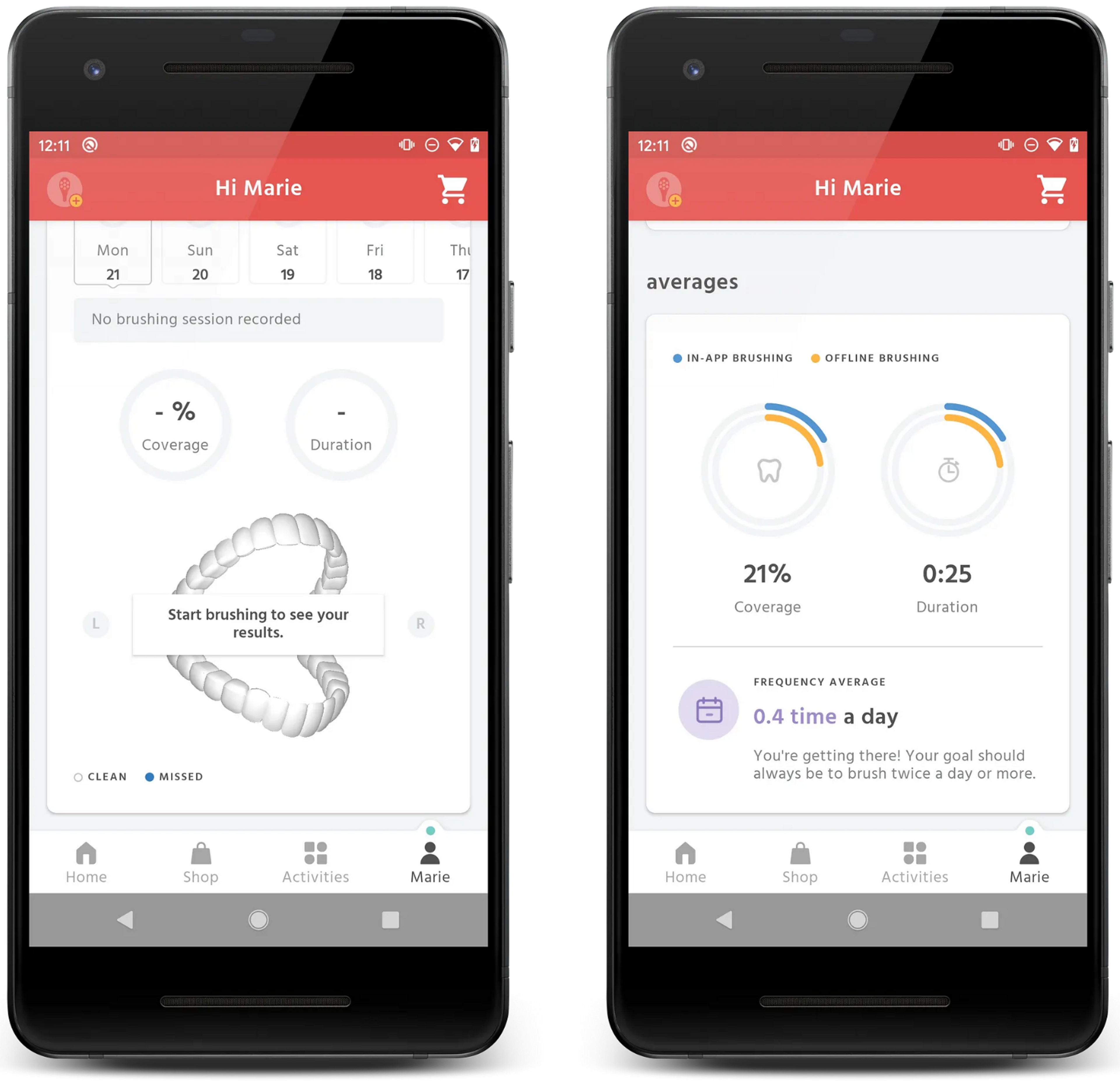
14}And there — we’re all set. Now we can test our brand-new Averages card UI while keeping it hidden from our production users until its implementation is complete. Below are screenshots of the app with the feature turned off (left) and on (right).
Feature toggles and branches by abstraction
It’s easy to think of togglable features as new and flashy client-facing pieces. But we shouldn’t limit ourselves here — these tools can be very effective behind the scenes as well.
Features and toggles form the basis of our implementation of the branch-by-abstraction concept, defined by Martin Fowler in his blog post. In this approach, we use features and toggles to swap one, legacy implementation of a particular interface with an updated one. This way we can keep the pre-existing functionality, while gradually building the new, refined version of it on the side, piece by piece. Every increment of the new implementation can be safely merged to the trunk branch without fear of breaking the production app.
To give a practical example, we introduced a new, improved version of our algorithms for calculating coverage. As you might expect, it took several iterations and tuning cycles to achieve the desired results. This is why we kept the old implementation active for our users and switched to the new one, safely kept behind a feature toggle, until it was ready for roll-out.
Chaining toggles and trigger side effects
As you have seen in the dynamic card example, both features and toggles are rather simple objects, without external dependencies. While this makes them lightweight and convenient to use in any part of the application, it also implies certain limitations. For example, we cannot:
- setup up dependencies between two or more toggles — for example, we may have a scenario when if one toggle is
true, the second one cannot betrue; - trigger side effects on toggle changes — like DB updates or remote API calls.
But we have a solution for that— in the form of toggle companions.
Toggle companions were designed to trigger any arbitrary logic based on changes of the associated feature toggle and manipulate toggles of other features if necessary. This way, both scenarios mentioned before can be achieved.
Our toggle companions are derived from the following class:
1abstract class FeatureToggleCompanion<T : Any>(
2    featureToggleSet: Set<@JvmSuppressWildcards FeatureToggle<*>>,
3    associatedFeature: Feature<T>
4) {
5
6    protected val toggle = featureToggleSet.first { it.feature == associatedFeature }
7
8    val feature = toggle.feature
9
10    val featureValue = toggle.value
11
12    protected abstract fun executeUpdate(value: T): Completable
13
14    fun update(value: T): Disposable =
15        executeUpdate(value)
16            .subscribeOn(Schedulers.io())
17            .doOnComplete { toggle.value = value }
18            .subscribe({}, Timber::e)
19}As a practical example, let’s study the case of marking a user account as a beta account. We use this extra option in our internal builds, to filter out test accounts from real users’ accounts. If the value of the toggle is changed, AccountRepository is notified. This triggers an API call which sets up the flag on the backend and syncs the content between remote and local databases.
1class MarkAccountAsBetaFeatureToggleCompanion @Inject constructor(
2    featureToggleSet: Set<@JvmSuppressWildcards FeatureToggle<*>>,
3    private val accountRepository: AccountRepository
4) : FeatureToggleCompanion<Boolean>(featureToggleSet, MarkAccountAsBetaFeature) {
5
6    override fun executeUpdate(value: Boolean): Completable =
7        accountRepository.markAccountAsBeta(value)
8            .ignoreElement()
9}
10
11@Module
12object MarkAccountAsBetaFeatureToggleCompanionModule {
13
14    @Provides
15    @IntoSet
16    fun provideToggleCompanionIntoSet(
17        companion: MarkAccountAsBetaFeatureToggleCompanion
18    ): FeatureToggle.Companion<*> = companion
19}Thanks to the power of Dagger Multibindings we’re also able to add the companion into an aggregated collection. This way we gain control over Disposable returned by its update method, so we can cancel that if needed.